

Aldus Manutius
He didn't just print books — he decided what a book was allowed to look like, and we're still living inside that decision.
By the time Aldus Manutius opened his print shop in Venice in 1494, he was already forty years old and had spent most of his life doing something that looked suspiciously like failure. He'd been a tutor. A wandering scholar. A man with ideas and no capital. What he had, instead of money, was an obsession: Greek. Not Latin, the working language of European scholarship, but Greek — the language that Homer wrote in, that Aristotle argued in, that the entire intellectual inheritance of antiquity had been encoded in and then, after 1453, largely lost to Western Europe when Constantinople fell.
His solution was radical enough to look simple. He would print the Greek classics in editions that working scholars could actually afford, carry, and read. Not the massive lectern-sized volumes that monasteries hoarded, but small, portable books — octavo format, roughly the size of a modern paperback — that could fit in a coat pocket or a saddlebag. To do this, he commissioned a new typeface specifically designed to mimic the handwriting of Greek manuscripts, worked with refugees from the fallen Byzantine court who still carried the texts in their heads, and hired a man named Francesco Griffo to cut a new italic type for the Latin editions that remains, with minor modifications, in use today. The first italic font was not an aesthetic choice. It was a space-saving measure. Aldus was trying to make books cheap enough to sell.
The Aldine Press between 1494 and Aldus's death in 1515 produced the first printed editions of Aristotle, Thucydides, Sophocles, Herodotus, Plato, and Pindar, among dozens of others. Without those editions, the texts might not have survived in sufficient copies to become foundational. But what's stranger and less discussed is what Aldus did to the experience of reading itself. He standardized the use of the semicolon. He popularized the comma as we use it. He introduced the concept of the title page. The book you're reading on a screen right now — its conventions, its punctuation logic, its basic physical assumptions — runs on infrastructure he built in a rented building near the Rialto.
He died exhausted, in debt, and reportedly frustrated by the number of people pirating his editions in Lyon.
Aldus Manutius hung a sign above his print shop door that read, in Greek, "Whoever you are, Aldus asks you to state your business briefly and be gone" — an early and extremely relatable attempt at a no-interruptions policy.
Why untold: Manutius is credited in design history for the italic typeface but rarely in general history for the deeper intervention: that he standardized the physical and typographic conventions that define what a "book" still means, making him invisible precisely because his innovations became the water everyone swims in.
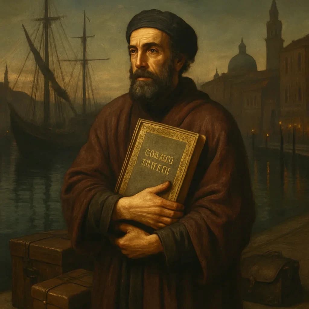
The Manuscripts Byzantine Refugees Smuggled Out of Constantinople
As Constantinople fell in 1453, a Byzantine scholar carried something out of the dying city that would quietly reshape Western civilization—not gold, not relics, but a stack of ancient Greek manuscripts nobody in Europe knew existed.
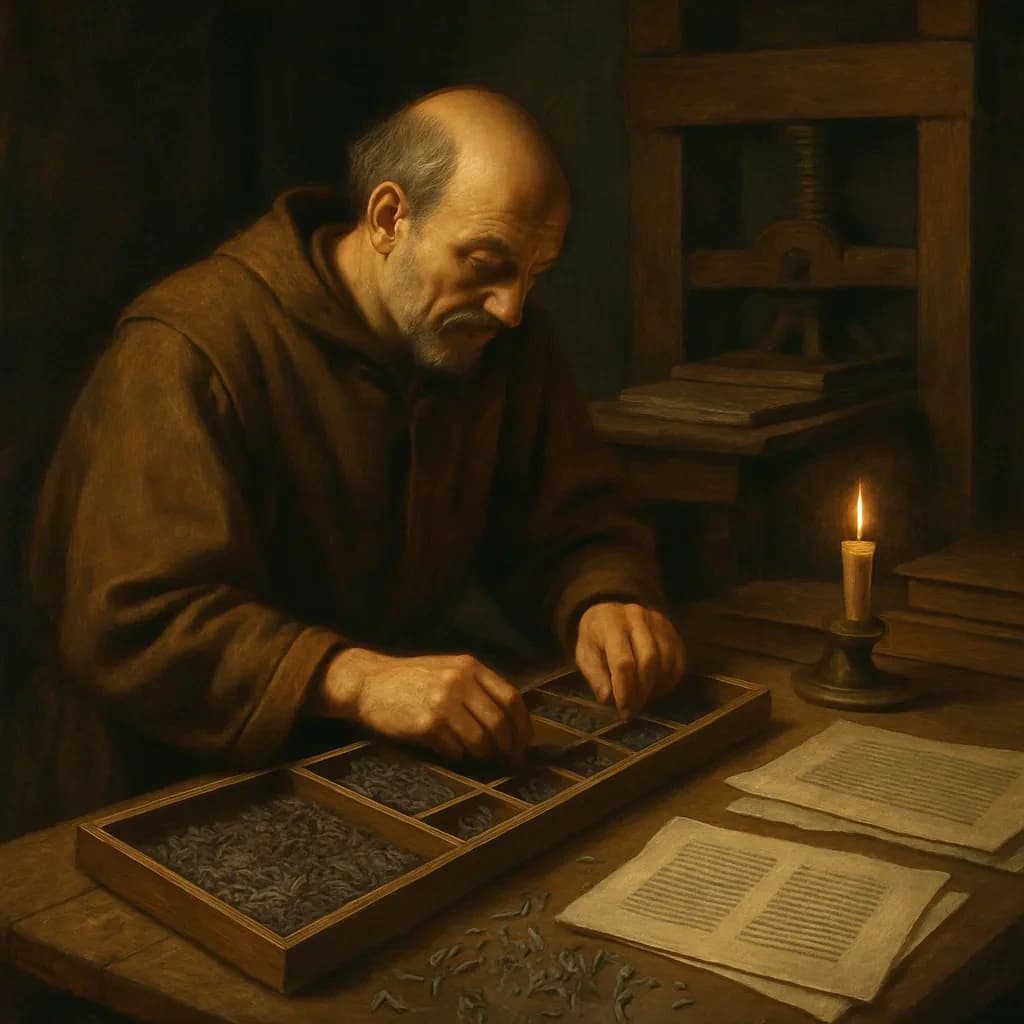
Italics: Born from a Printer's Need to Save Paper
A printer's apprentice made one small change to a manuscript in 1501—and ended up shaping the modern world.
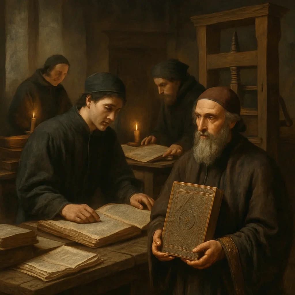
Galen's Greek Original: The Book That Made Medicine Worse
A Greek scholar fled the fall of Constantinople in 1453 carrying the most important book in Europe—and nobody could read what it actually said.
— Martin Lowry, The World of Aldus Manutius: Business and Scholarship in Renaissance Venice (Cornell University Press, 1979)
— Nicolas Barker, Aldus Manutius and the Development of Greek Script and Type in the Fifteenth Century (Fordham University Press, 1992)
— Anna Hobson, Renaissance Book Collecting: Jean Grolier and Diego Hurtado de Mendoza, Their Books and Bindings (Cambridge University Press, 1999)